
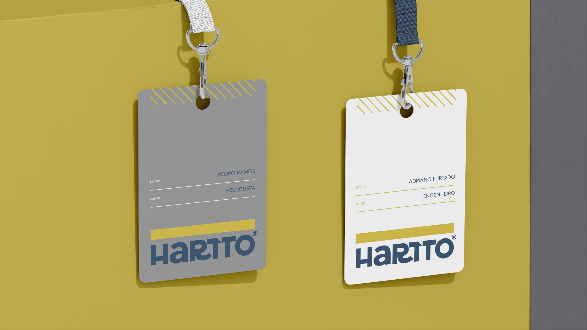
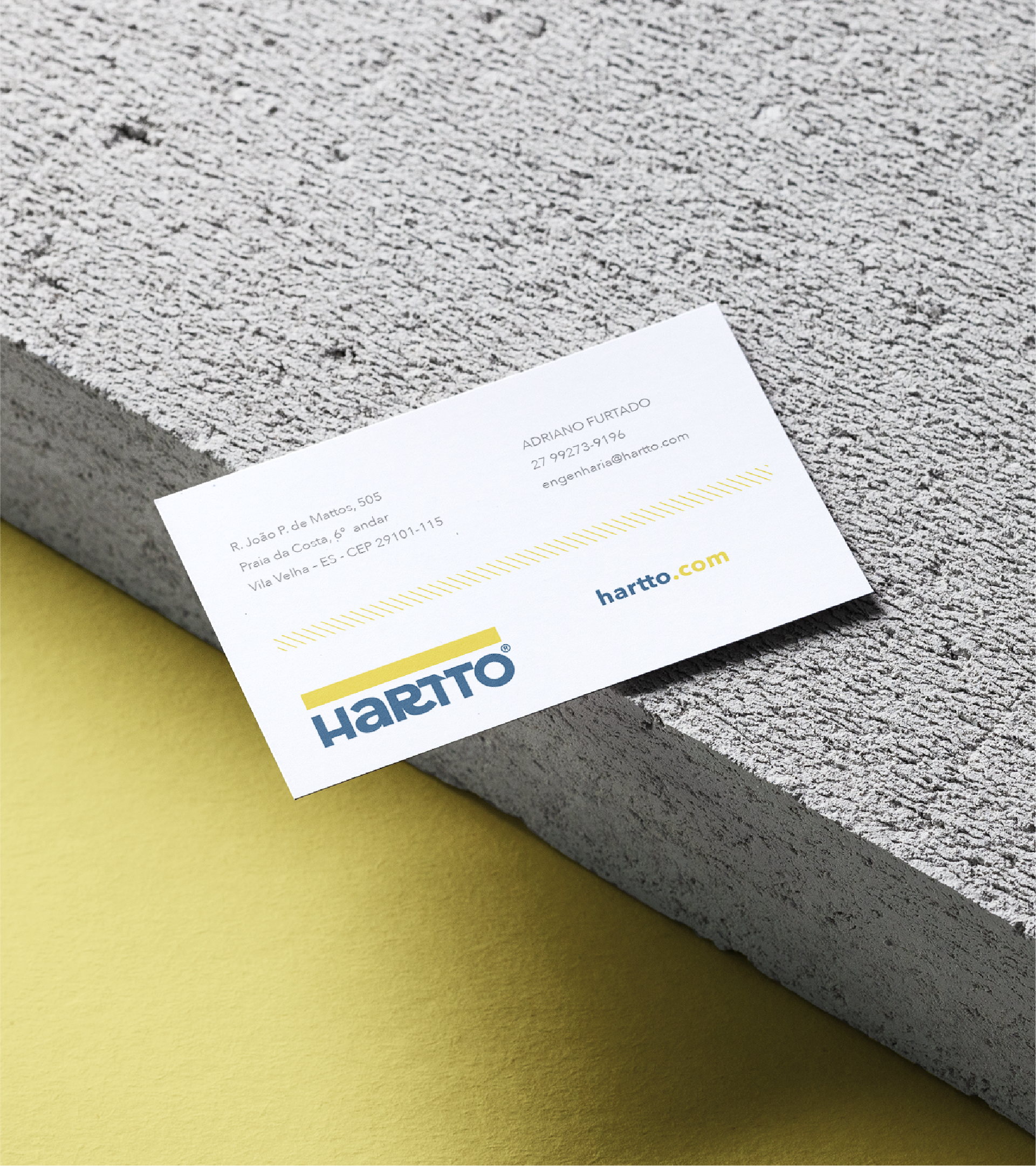
HARTTO
Structural Engineering
2022
Vila Velha, ES
©Monjardim
All rights reserved
NAMING, LOGO DESIGN, AND VISUAL IDENTITY
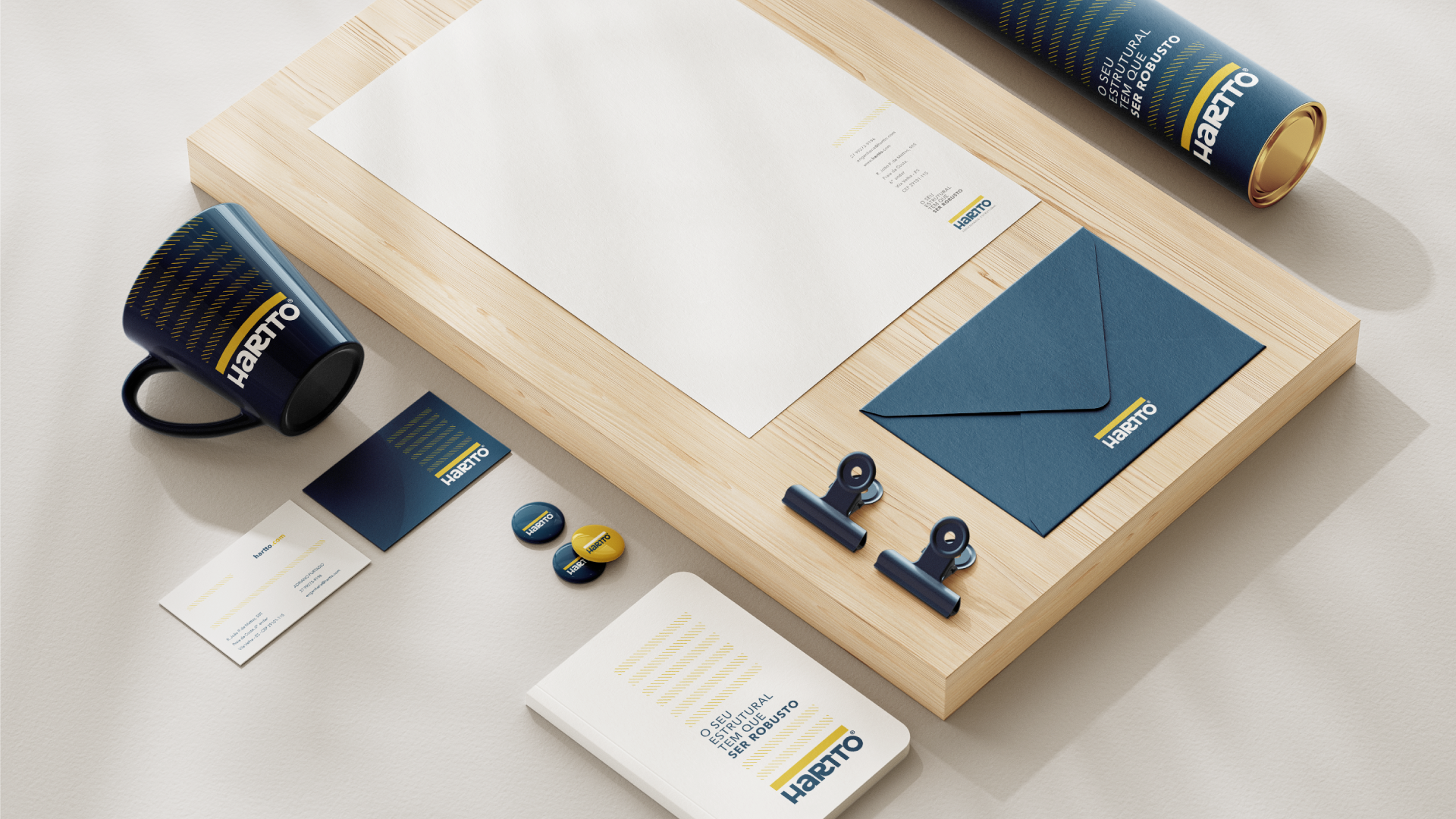

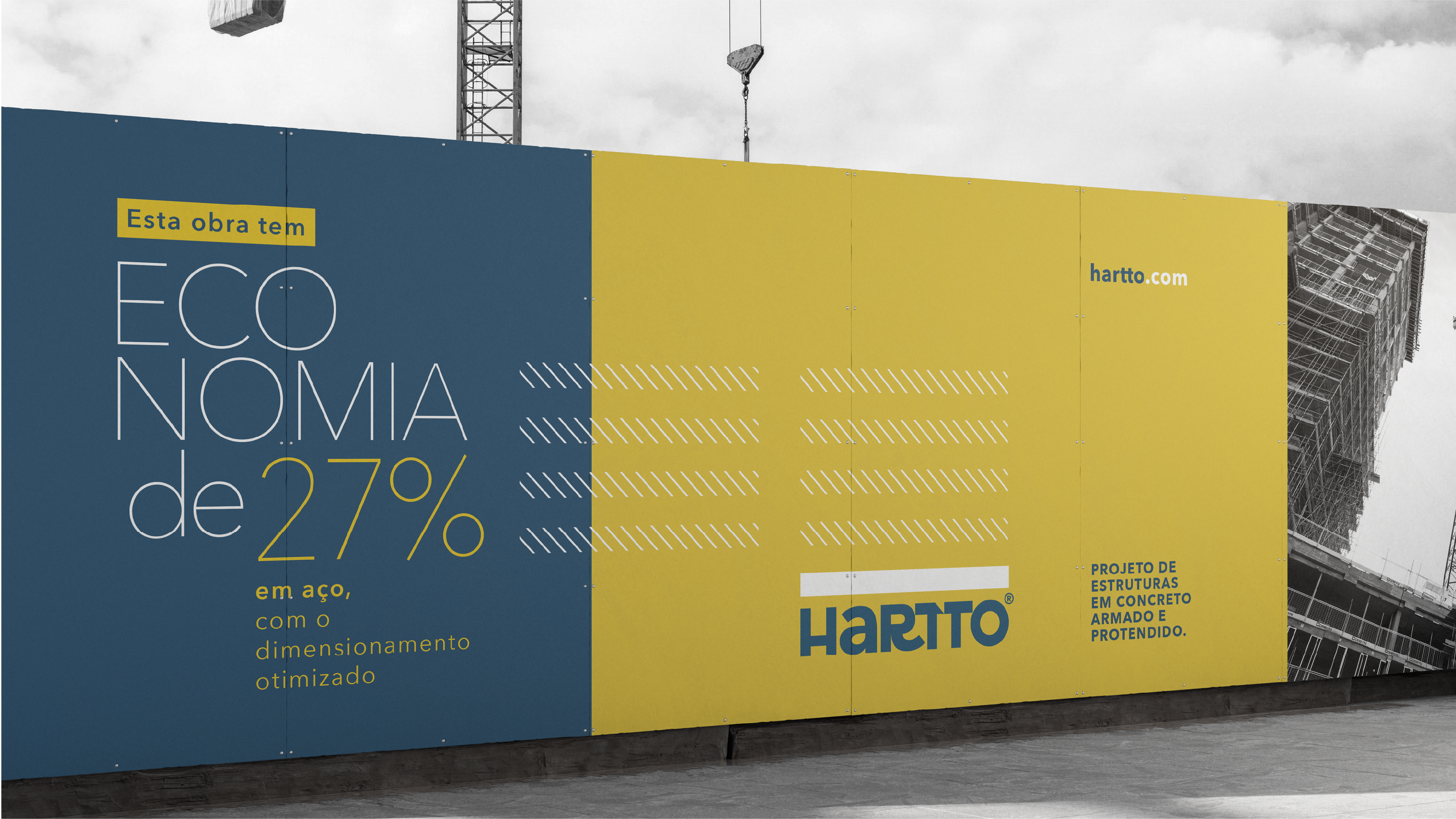
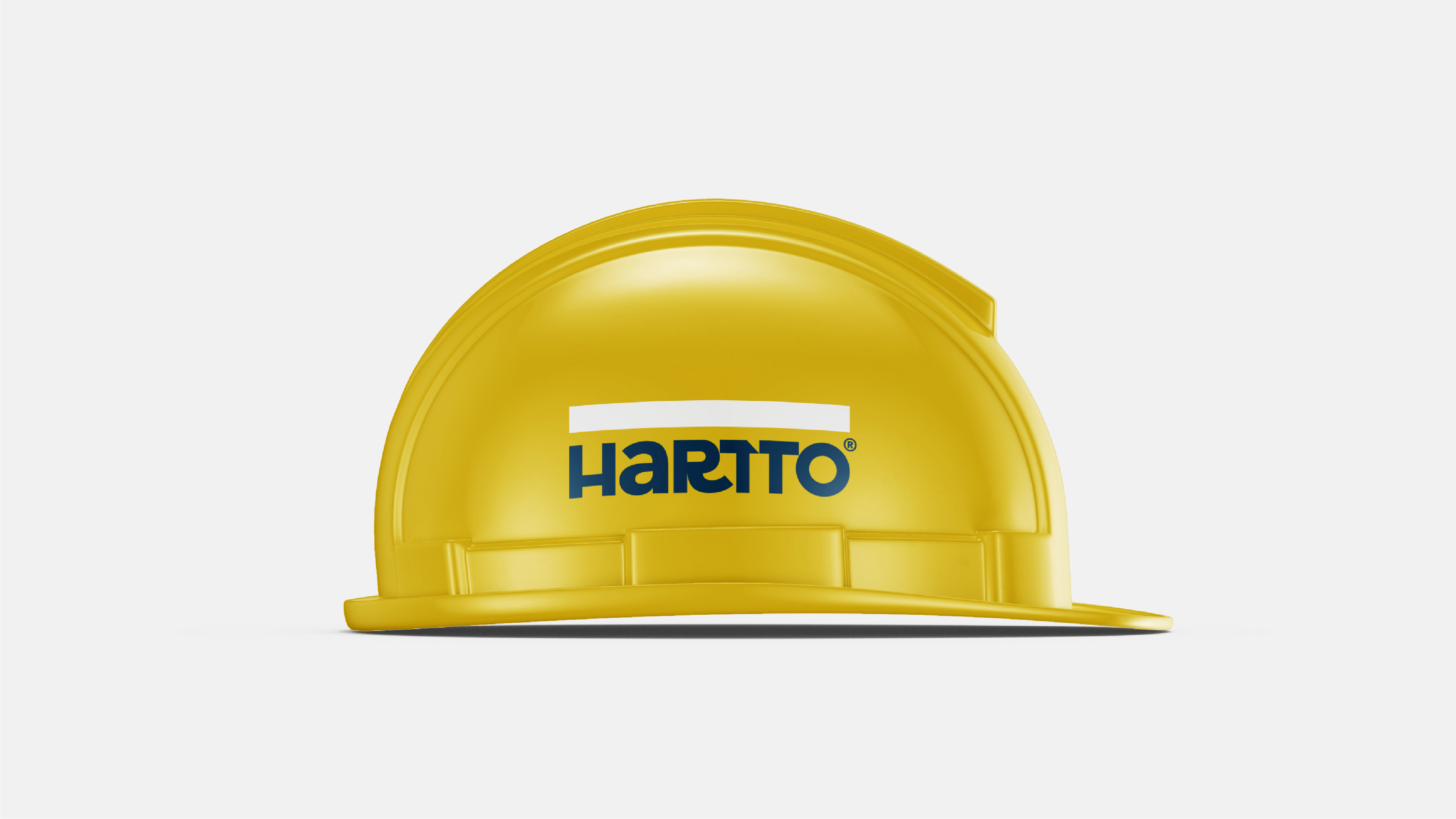
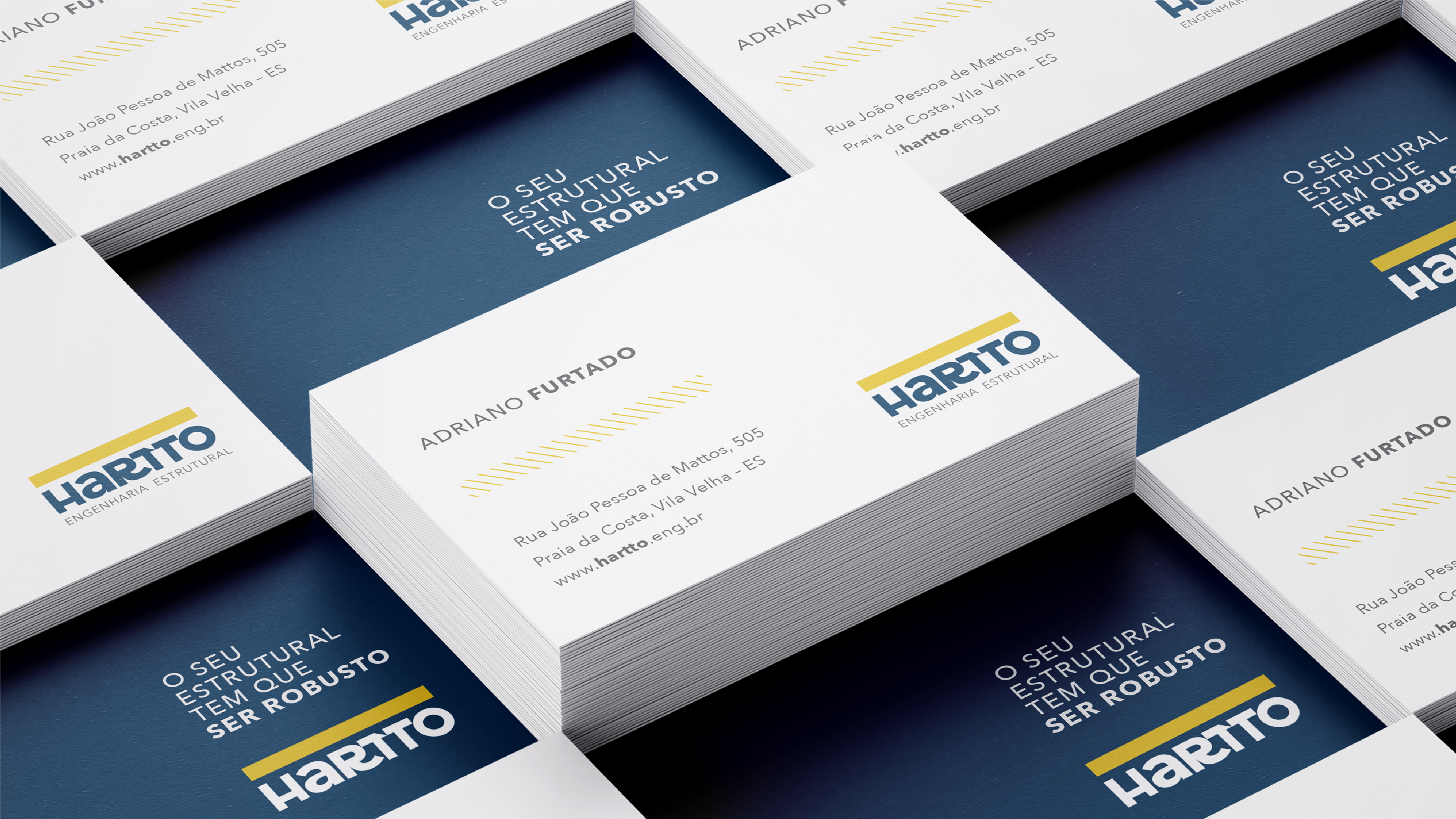
"When we first approached Leandro, our company had a different name and brand, and we were very unhappy with both. Leandro not only suggested the name Hartto but also developed the company’s entire visual identity. Nearly two years after the project was delivered, we can clearly see that our brand resonates very well with our target audience. We’ve achieved our main goal of repositioning ourselves in the structural engineering market, and we owe that in large part to our name and our brand."
ADRIANO FURTADO - Executive Director of Hartto
DELIVERABLES:
concept, naming, brand and visual identity, slogan, suite of materials, pitch deck
SIMILAR PROJECTS:
Did you like what you saw?
This project is an example of how we deliver results through branding and design. If this is what you’re looking for for your business, schedule a consultation. We’ll understand your challenges and find a creative solution that transforms how your brand is perceived.

leandro@monjardim.com