


FACTO
Foundation for the Support of Science and Technology Development
2025 Rebranding
Vitória, ES, Brazil
Third Sector:
Foundation for Research Support
DELIVERABLES: Diagnosis · Brand Strategy · Visual Identity · Verbal Identity · Brand Guide · Commemorative Seal
→ Monjardim® All rights reserved
Turning knowledge into social impact.
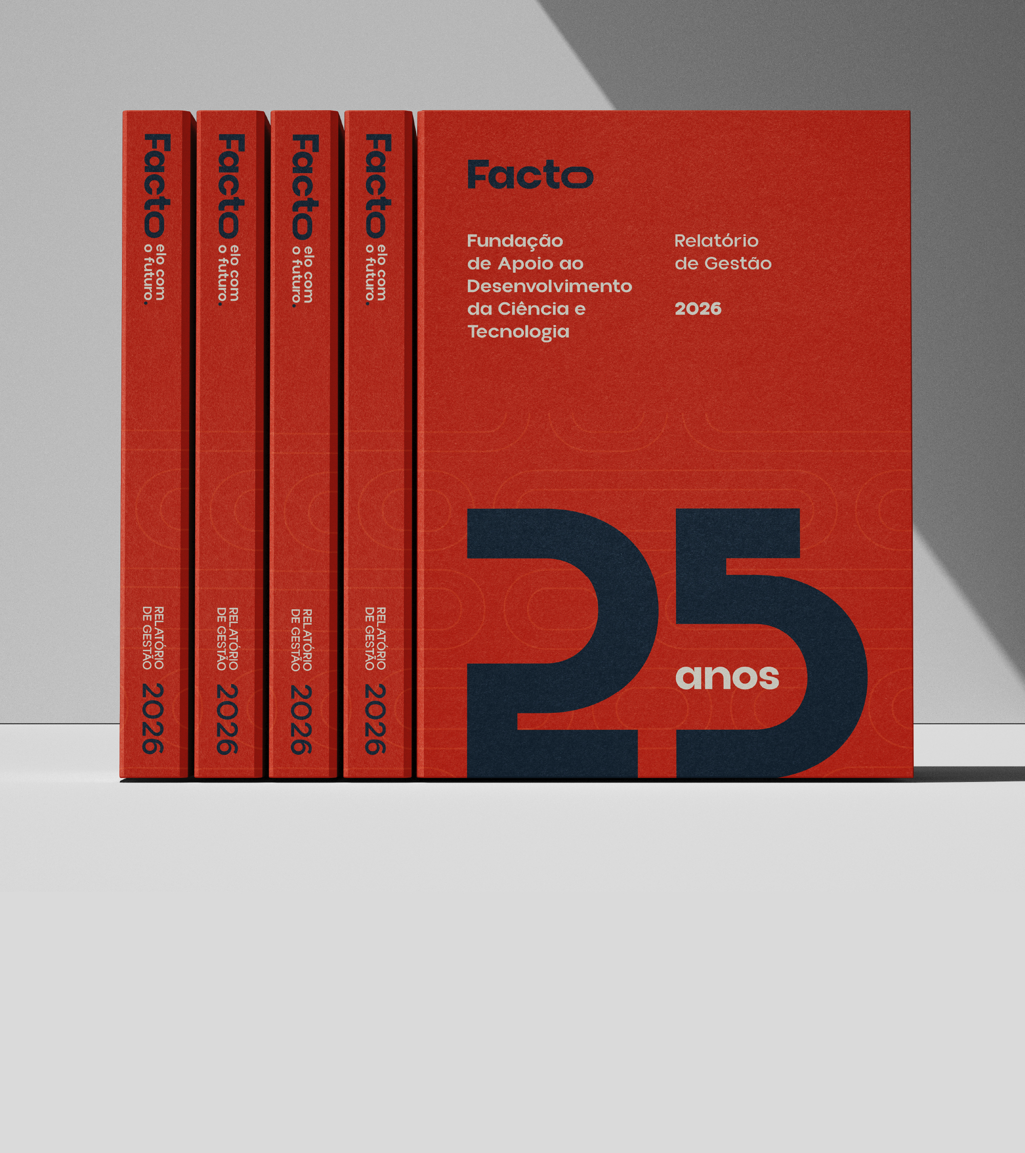
At age 25, Facto was seen as an administrative department. → The rebranding repositioned it as the partner that takes research all the way to the impact it generates.
CHALLENGE
Supporting foundations make public research happen: they purchase, contract, manage resources, and are accountable so that science, outreach, and innovation projects can move beyond the drawing board. It is essential yet often overlooked work. Outsiders rarely know how to explain what a supporting foundation does.
Facto was celebrating its 25th anniversary with a new headquarters and the ambition to become a national leader among support foundations. Its brand identity, designed for a different era, no longer reflected its current scale. To some audiences, Facto was still just the department that handled paperwork, and the impact of its projects wasn’t translating into brand recognition.
→ The challenge was to highlight Facto’s true role without losing sight of what has sustained it for 25 years: ethics, transparency, and care for people.
STRATEGY
We started by listening. We interviewed key individuals, employees, advisors, and partners, and cross-referenced their comments with feedback forms from those who follow Facto closely. At the Forum—the decision-making stage of our method—the leadership team finalized the project’s choices with the design studio.
The diagnosis revealed a disconnect. Internally, Facto saw itself as a bridge between academia and business and a safe haven for researchers. Externally, it was perceived as an administrative department—efficient but distant. Its value lay in what it made possible, and that was precisely what the brand failed to convey.
→ We define our mission: to transform knowledge into social impact by connecting science, people, and the future.
Facto is no longer defined by the processes it carries out but rather by what those processes make possible. The profile of the Caregiver—with traits of the Sage—guides this role: to protect, to enable, and to explain.
Two decisions round out the strategy. The brand identity takes on a voice of its own, without any visual elements from IFES, which positions Facto to support other institutes with the necessary independence. And the new brand is being launched all at once, as the organization marks its 25th anniversary.
CREATION
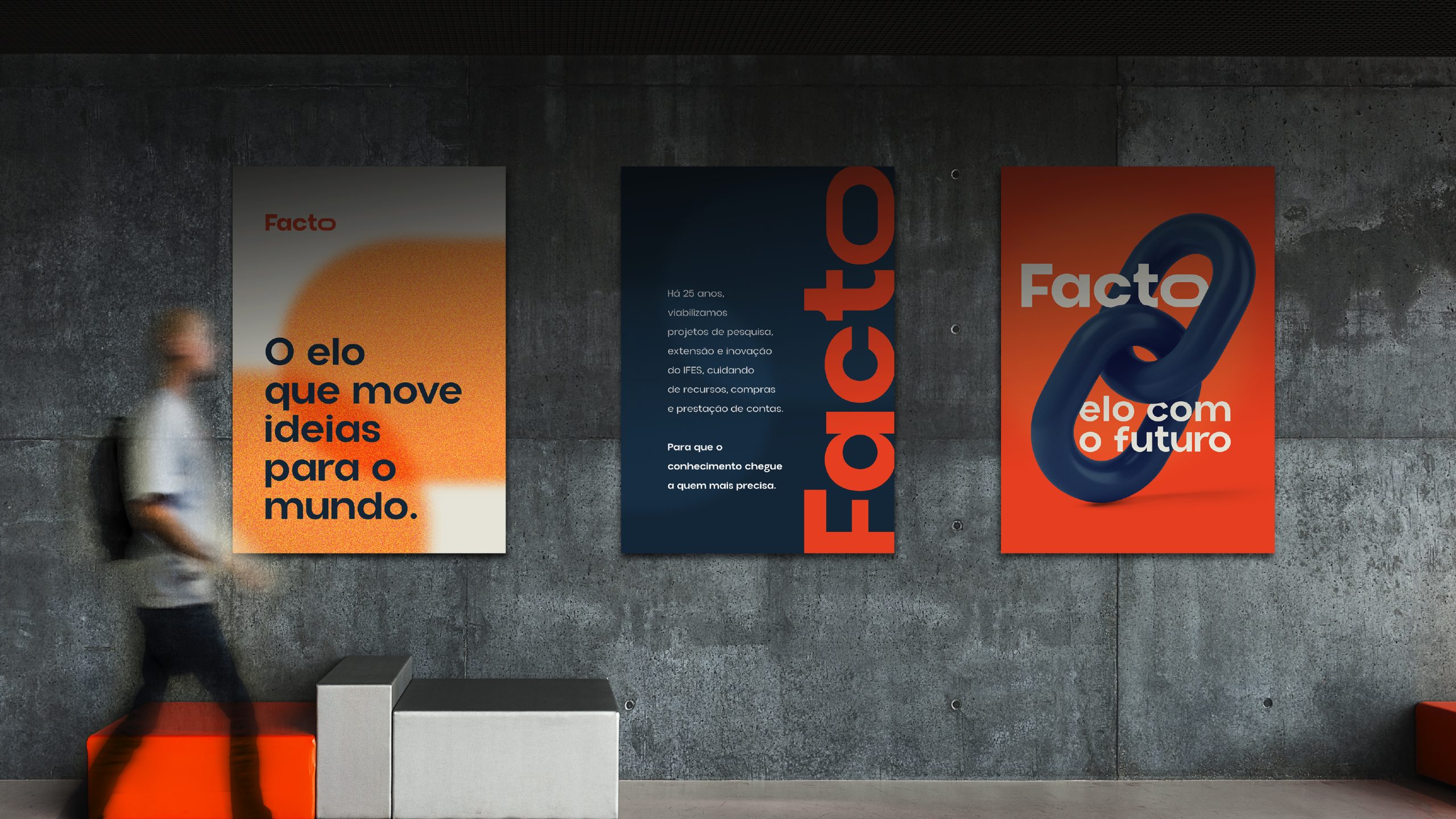
Three guiding principles shaped the design: technical, modern, and accessible. From the words that describe Facto’s role (bridge, harbor, bond, connection, support), we chose the one that sums them all up: link. It became the core of the system because it describes what the foundation does to bridge the gap between research and impact.
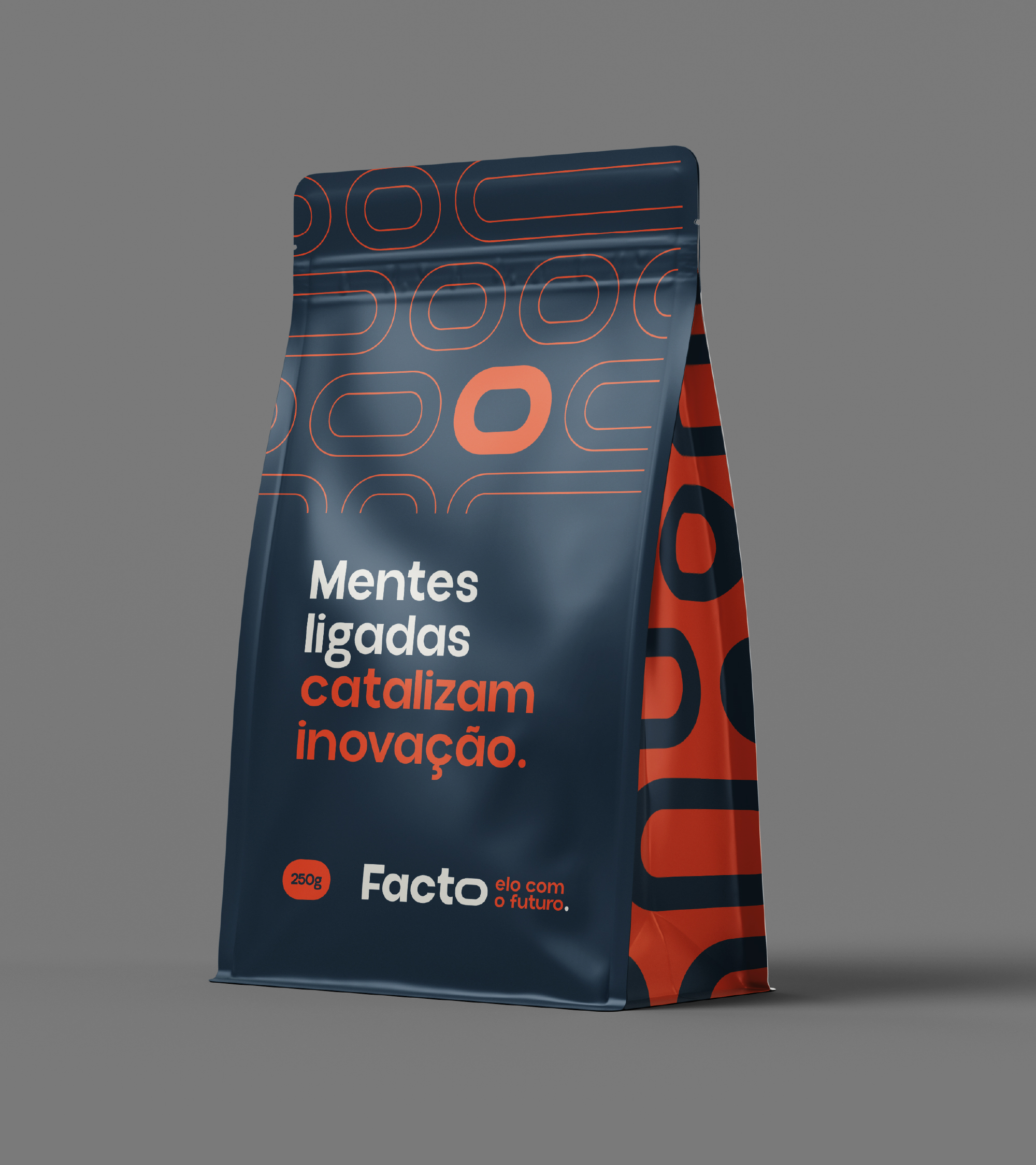
In the logo, the letter "O" in "Facto" forms a link. The symmetrical typography conveys stability, and the open shapes create a sense of closeness. On its own, the link serves as a symbol while still conveying the name.
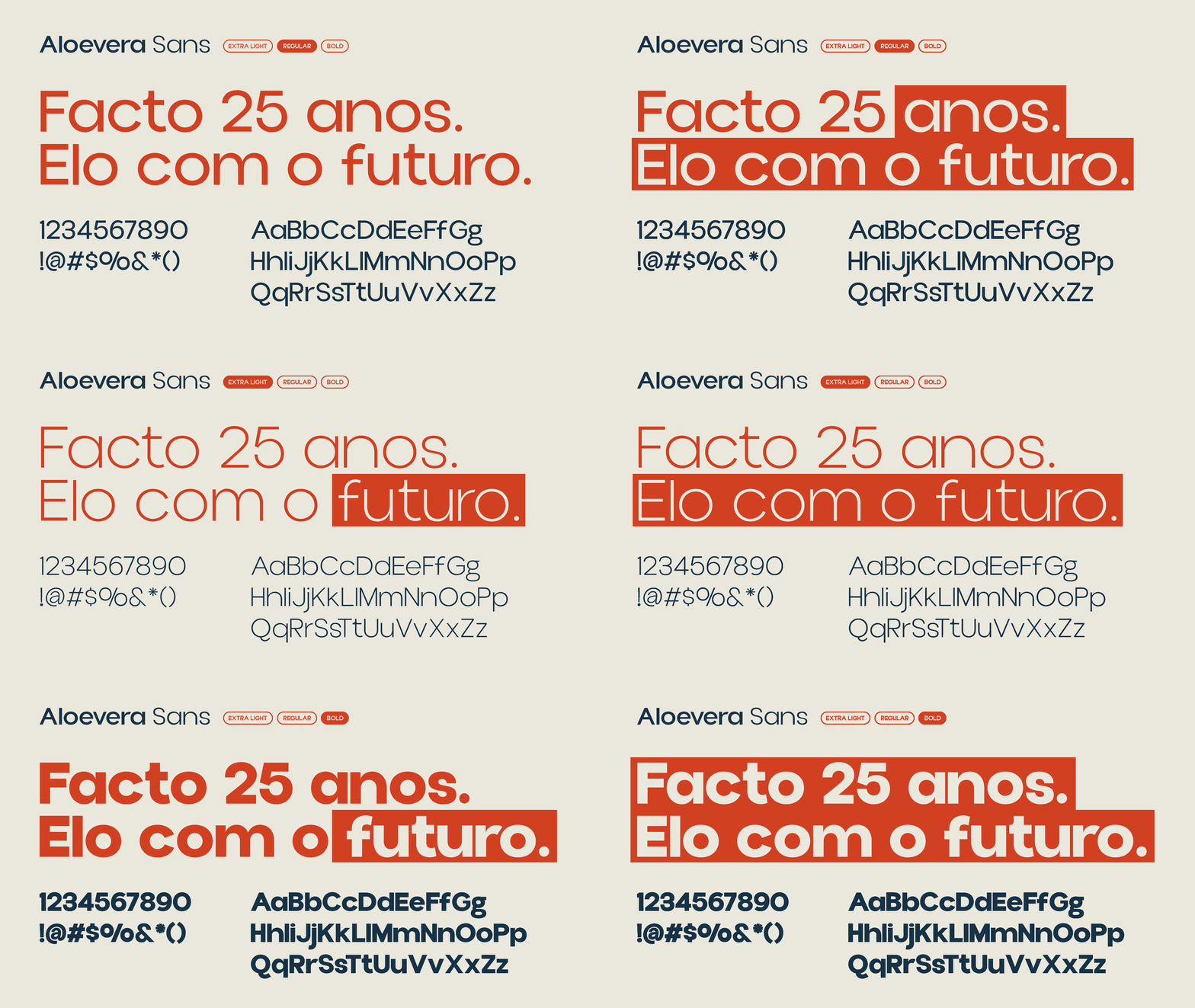
We retained the red—which was already part of Facto’s identity—and transformed it into “Pulso Vivo”: the energy of impact. The deep blue, “Porto Seguro,” conveys the rigor of those who manage public resources. The off-white, “Caminho Claro,” offers a moment of respite. The Aloevera typeface combines technical geometry with open strokes.
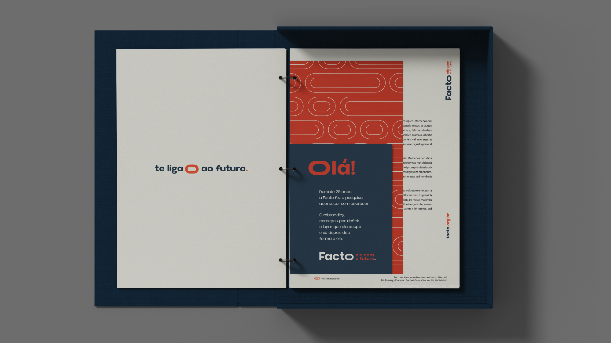
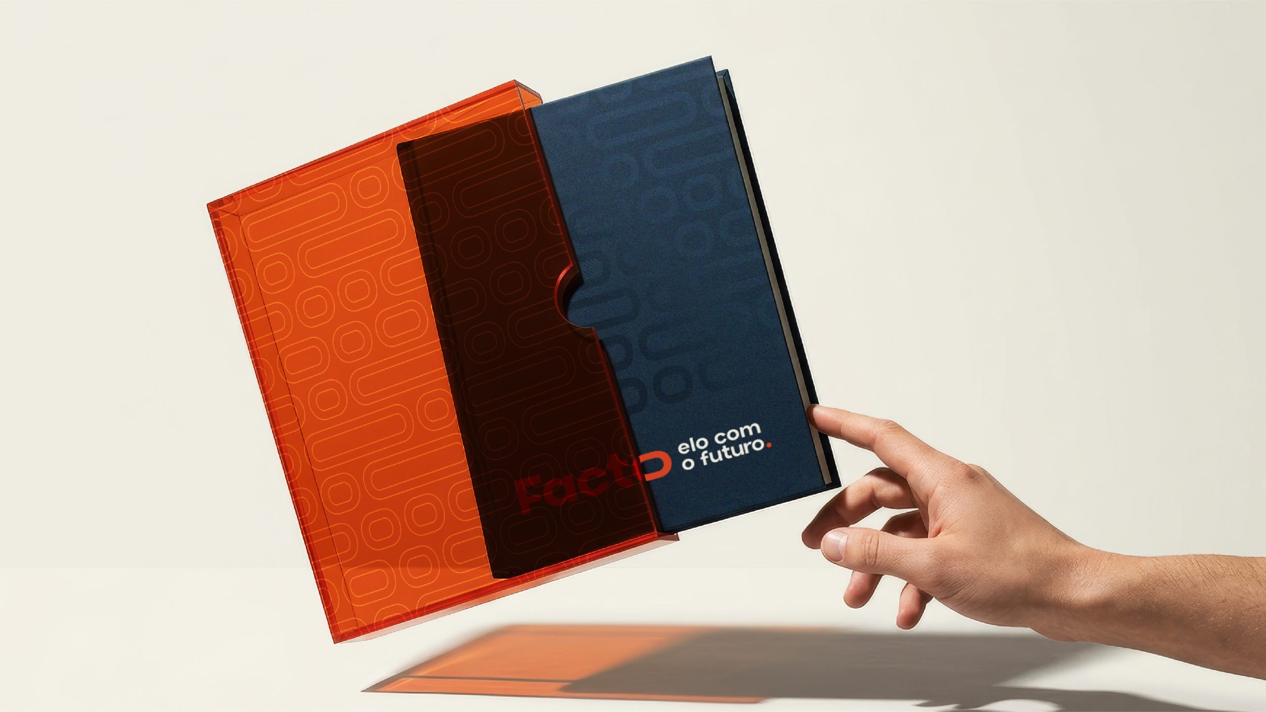
From the link module come patterns and logos for content, giveaways, and events—such as “Connects You to the Future,” “Connects You to Impact,” and the 25th-anniversary logo. These are elements that the team can combine without needing a designer for every application.
The voice is clear, trustworthy, relatable, and inspiring. It replaces administrative jargon with the stories that the projects tell: “Behind every research project is a story that transforms lives” and “Facto is by your side to turn ideas into projects.”
APPLICATIONS
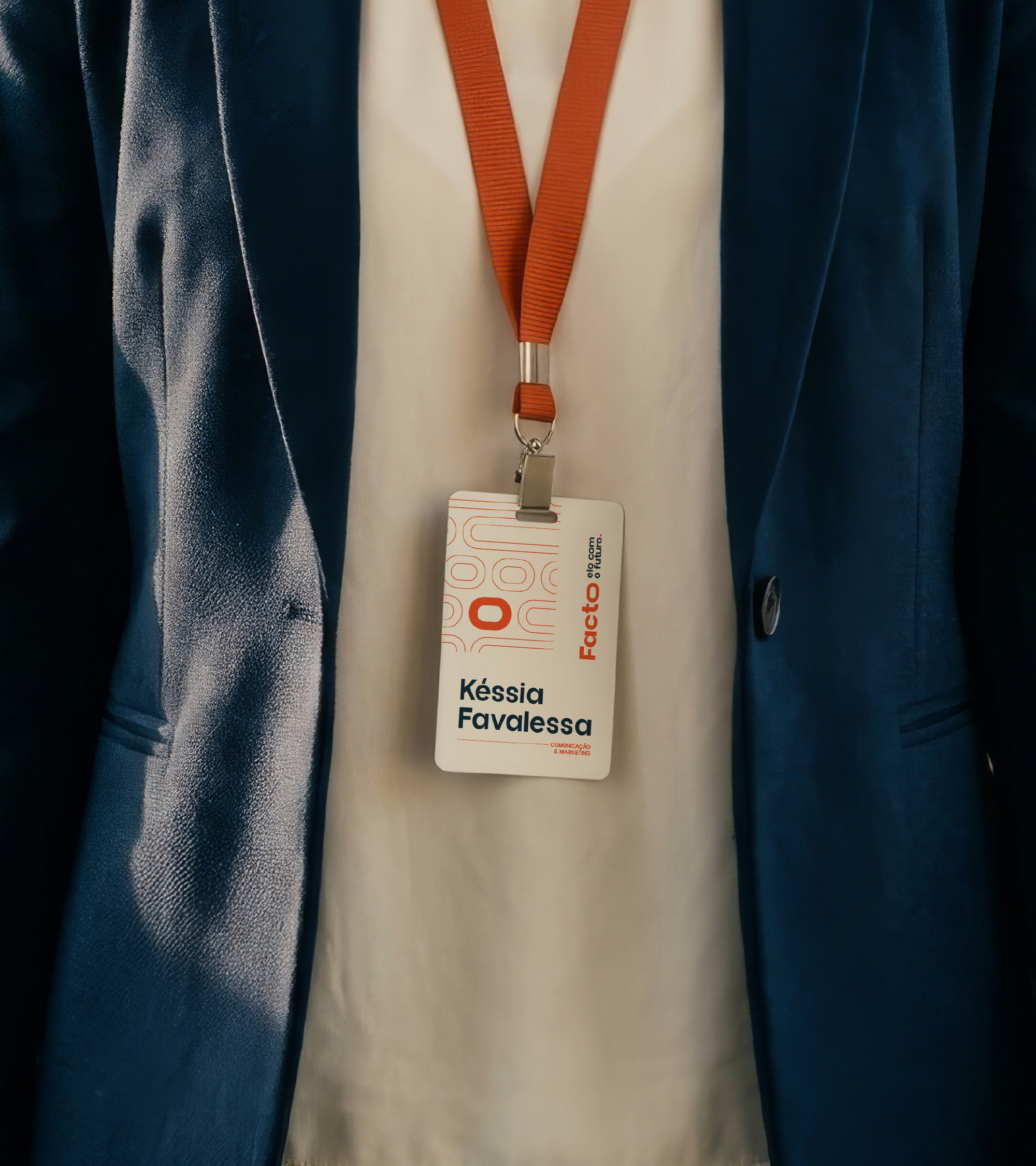
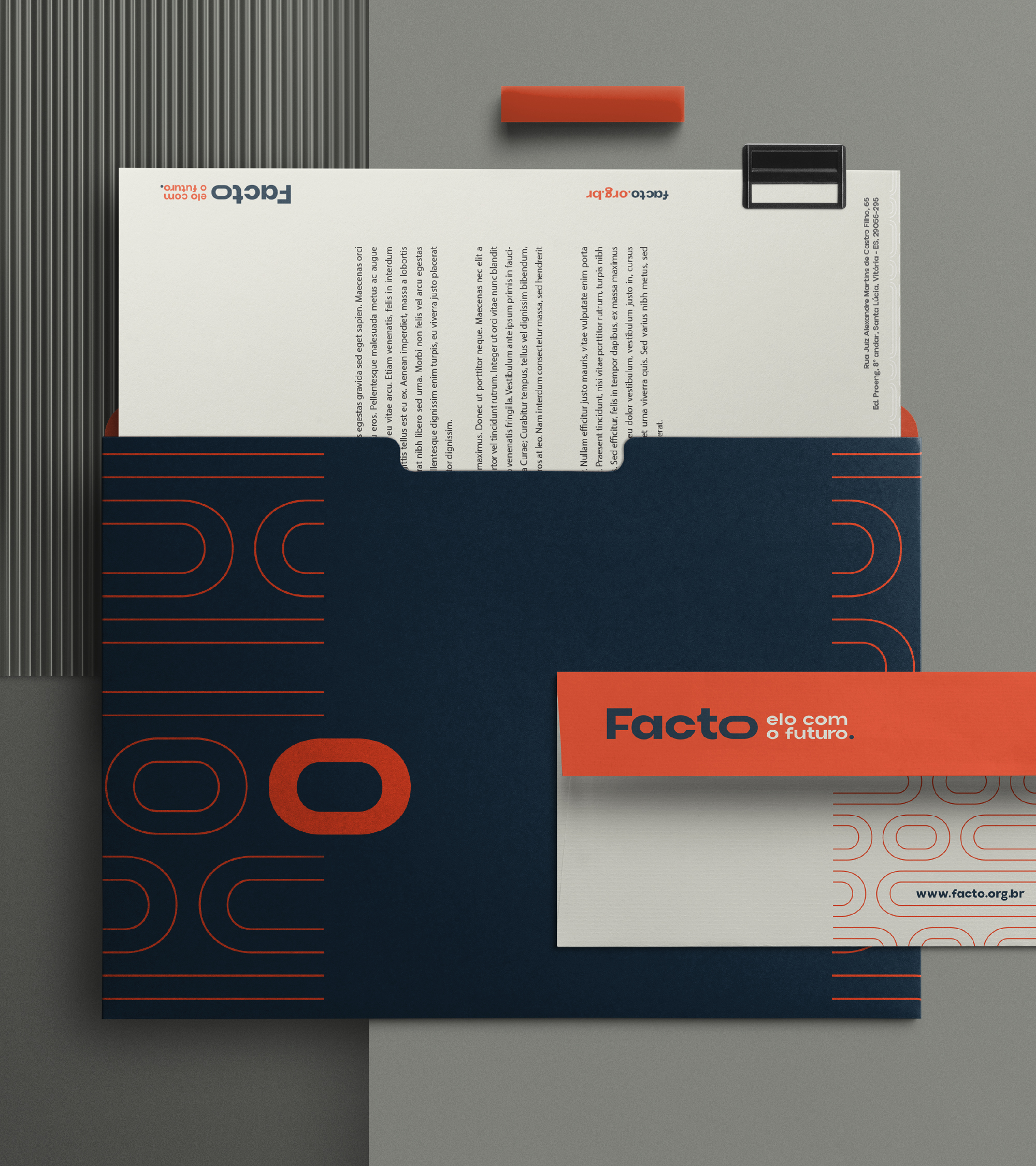
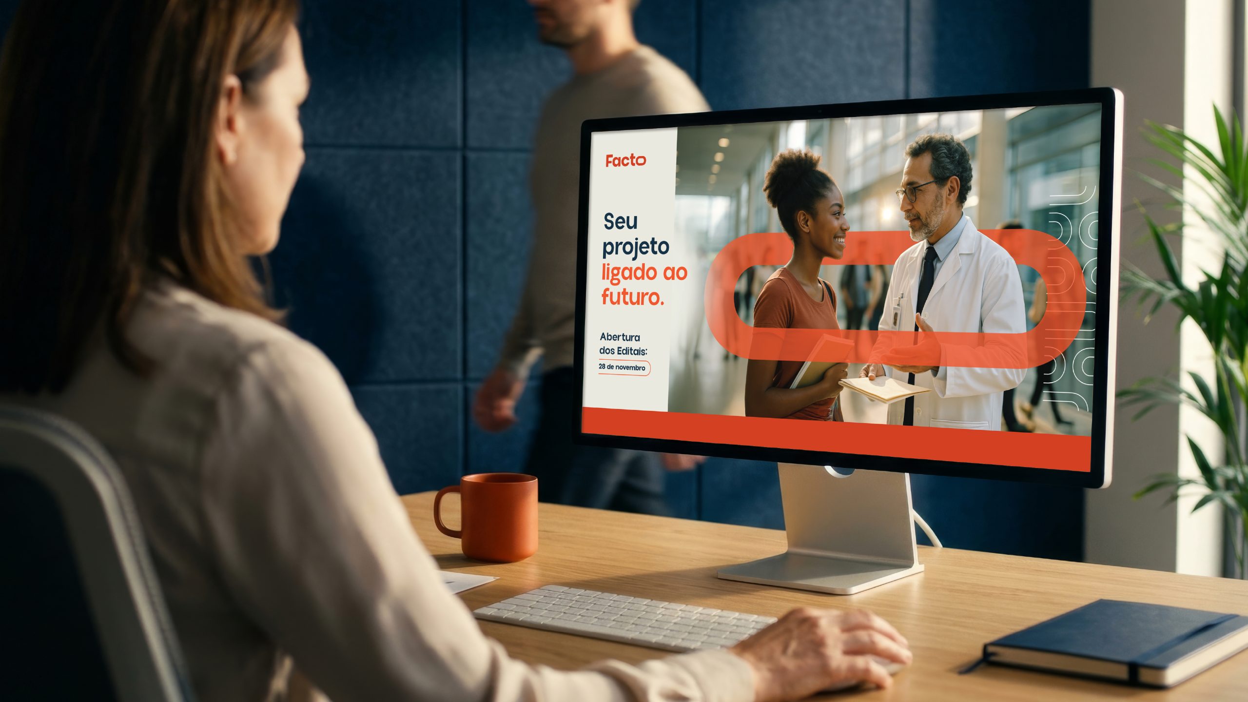
The system began with the elements that represent Facto every day: business cards, letterhead, email signatures for the entire team, and presentation templates. These are the elements that bring the new brand to every meeting, proposal, and report.
RESULT
The first change is in how the brand is perceived: Facto has adopted a simple way of explaining what it does, and the team has been provided with a Brand Guide to apply the brand independently. The new identity was rolled out all at once, coinciding with the company’s 25th anniversary, and is already being used in the brand’s communications and other applications.
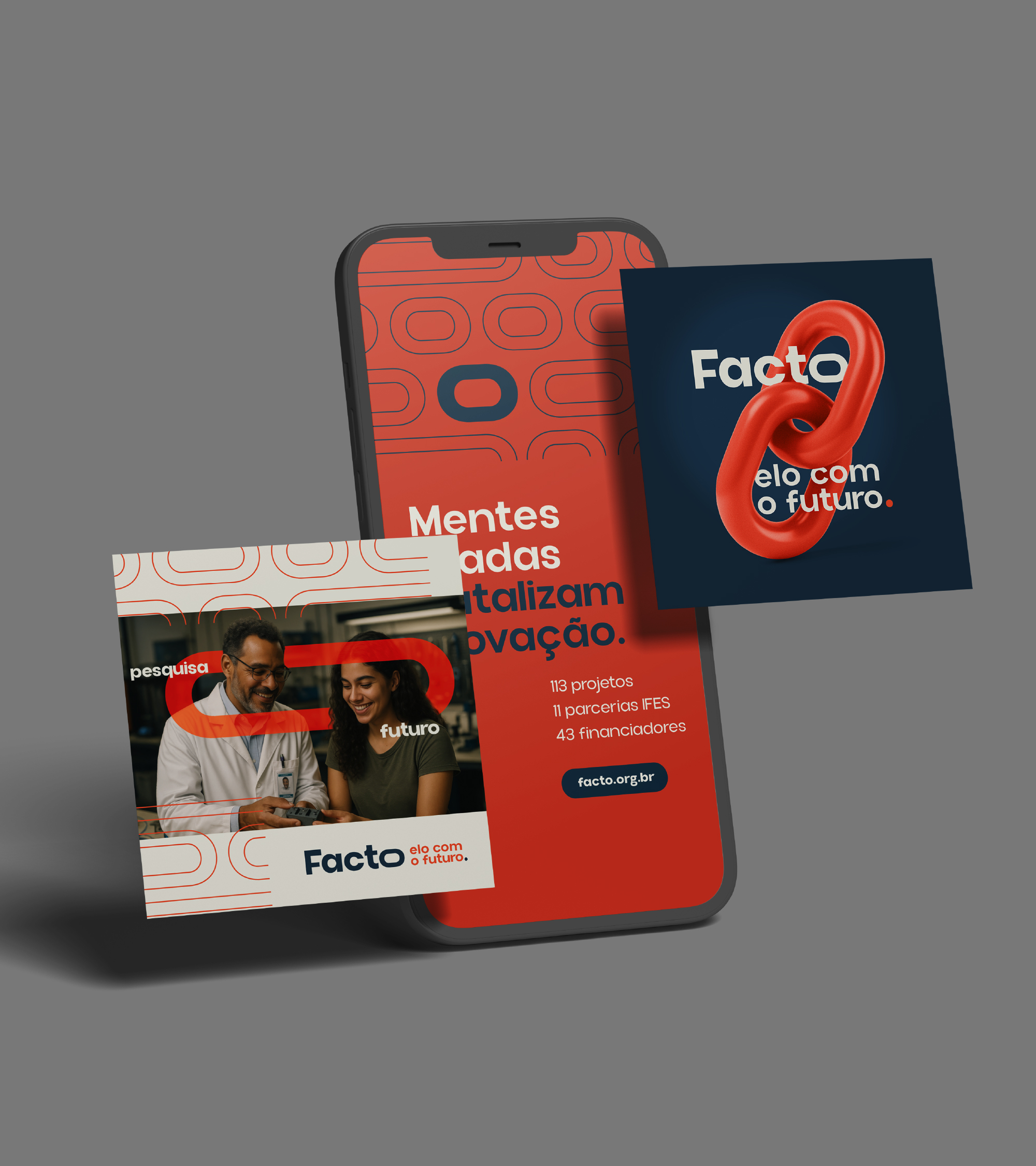
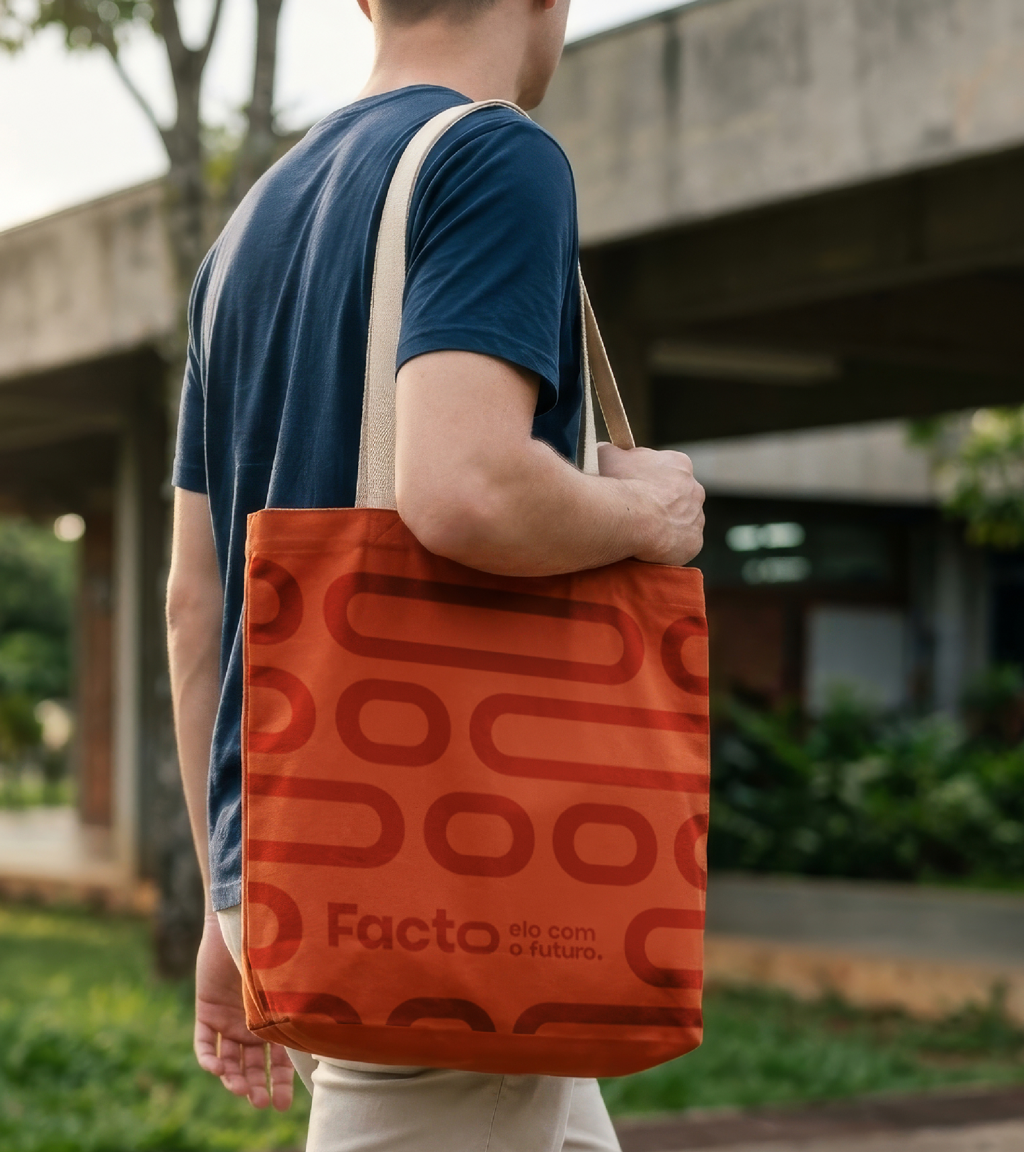
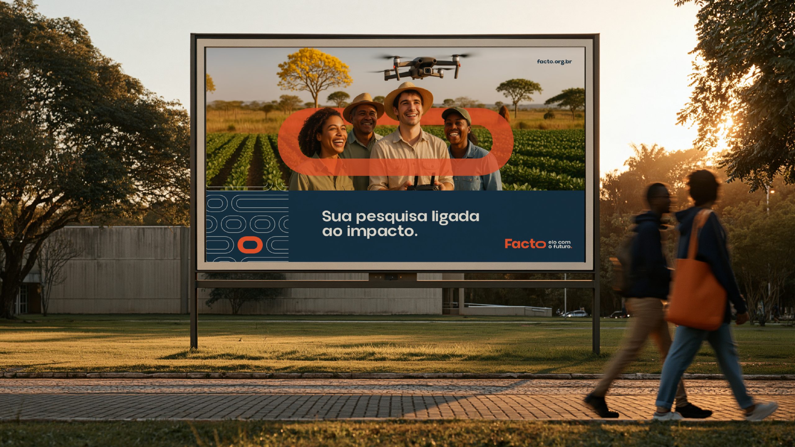
"Elo" was the word you heard most often in connection with Facto. Now she's at Marca.
Client: Facto · Foundation for the Support of Science and Technology Development Type: Rebranding Period: June 2025 – March 2026Deliverables: Assessment · Brand Strategy · Visual Identity · Verbal Identity · Brand Guide · Stationery and Templates
Client Team: Klinger Caprioli · CEO — Everton Cunha · Superintendent — Késsia Favalessa · People and Management Manager
SIMILAR PROJECTS:
Did you like what you saw?
This project is an example of how we deliver results through branding and design. If this is what you’re looking for for your business, schedule a consultation. We’ll understand your challenges and find a creative solution that transforms how your brand is perceived.

leandro@monjardim.com